The Renfert design at a glance
Corporate Design Guidelines
This Corporate Design Guideline introduces the rules for design and how to deal with the basic elements. A resource that describes how the design elements are used in communication to achieve an unmistakable and vibrant company identity. This guideline will accompany the development of the company and its environment and will always be kept up to date.
Corporate design makes corporate identity visible
The “corporate design (CD)” makes Renfert’s “corporate identity (CI)” visible. The CI is described in the Brand Identity Manual. The goal of the CD is to visualize the company values in a consistent appearance that provides the company with an effective identity, expresses its personality and contributes to the worldwide recognition of the Renfert brand. This requires a consistent visual language for use with customers, partners and employees.
About Renfert
Renfert GmbH is an independent, privately owned company in the worldwide dental market and plans to remain autonomous in the future.The company is in its 3rd generation of owner management and has been manufacturing dental devices, instruments and materials for more than 90 years. Development and production occurs solely at the Renfert headquarter in Hilzingen, Germany according to very high quality standards. Renfert is the market leader in some product areas and continuously develops its core competencies in these areas. Renfert is active internationally with an export share of over 75%. To serve the markets optimally, there are subsidiaries and affiliates, branch offices and external employees who work locally in specific markets.
Media Style guides
The style guides contain detailed information on the individual media. There is a list of the available style guides in the right column. You can request these from Renfert: bWFya2V0aW5nQHJlbmZlcnQuY29t
Company Brand
The following sub-sections contain all guidelines on the Renfert company brand. The Renfert company logo can be downloaded in the required formats in the boxes on the right side.
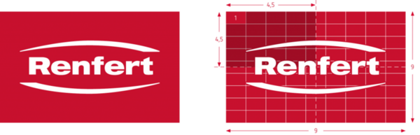
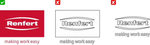
The Renfert logo consists of a combined word and figurative mark. It is placed within a circumscribing brand space, which creates a protected area for the logo. As a result the logo can be used on various backgrounds and images.
For a clear identity and recognition, the brand space is always in the red brand color. The word and figurative mark is placed on it in white. The precise color values can be found in the brand colors section.
You can download the logo here.
Minimum size
The smallest reproduction of the brand logo is at a width of 10 mm. Full color tones must be used when printing in this size. This prevents a blurred reproduction as the result of a halftone. The claim may not be used in the smallest reproduction sizes.
Recommended minimum size
If there is the possibility for a larger reproduction, the width of the logo should be at least 20 mm. The brand claim can be used at this size or larger.
Optimal size
Depending on the application, the logo can be used scaled to different sizes. The following dimensions are defined as standards:
Width: 44 mm / 1.73″:
- Full-page advertisements (210 x 297 mm / 8.5 x 11″)
- Covers of catalogues, brochures, flyers (210 x 279 mm / 8.23 x 11″)
Width: 34 mm / 1.34″:
- Half-page advertisements (105 x 297 mm / 5.5 x 8.5″)
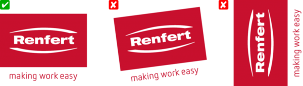
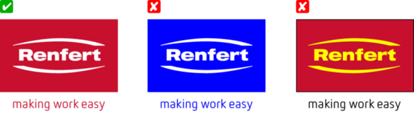
making work easy
The performance promise is a message that makes Renfert unique and distinguishes it from the competition. The slogan is used in communication media with a promotional performance message. The slogan is used internationally in English. To emphasize the brand and product promise, the slogan is used in combination with the logo.
Use as a claim
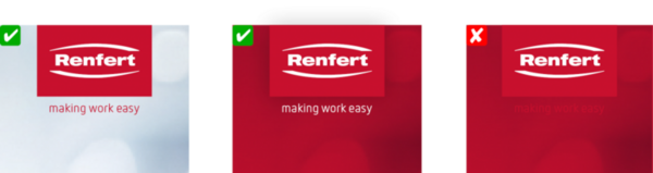
From a logo size with a width of 20 mm/56 px the slogan is positioned beneath the logo as a claim. This variant is the standard and is the preferred one to use. The size is derived from the width of the word and figurative mark. The baseline of the claim is located two units below the brand space. Depending on the background, the claim is used in red or white. It must be ensured during placement that the claim can be read without any difficulties. The font is the Renfert corporate display font »FF Netto« in the style »regular«.
Use as a slogan
If the slogan is part of a statement (for example in advertisements) or if it is used as a call to action (for example in web banners), it can be used separately from the Renfert logo. However, the Renfert logo or the brand name must be in the immediate vicinity, because the slogan alone cannot be unequivocally assigned to Renfert. The font is the Renfert corporate display font »FF Netto« in the style »light«. Applications for this use are found in the respective style guides.

Brand colors
In addition to text and image content, colors also convey messages. Due to their effect, they address the senses directly. At Renfert, the brand color together with the expanded colors make up the company’s corporate colors. They have the important task of serving as the brand representative to the target group in their effect.
Effect
Red is the energy of the brand, and as the sole color sets the tone of the Renfert brand identity. As a primary color, red combines the positive attributes for the Renfert brand: striking, stimulating, activating, exciting, animated, passionate and charged with energy.
Use
The Renfert brand logo is defined in a solid red. To repeat the brand color, in publications texts (headings and emphases), graphic areas and text boxes are also colored red. Another use is coloring background images. For details, please refer to »Renfert imagery«.
Color systems
For optimal and therefore consistent color reproduction in all media channels, specific color values are defined for print and digital applications. For printed matter, the color values of the HKS® (full color), PANTONE® (full color) or CMYK (grid color) color systems are used. For digital media, the RGB or web color values must be used.
Color values: Red
- CMYK | Print 10–100–80–0
- HKS 3000+ | Print | Color System: K+N 15–100–0
- PANTONE | Print | Color System: Solid Coated 186C
- RAL | Color 3020 traffic red
- RGB | Screen 200–16–46
- HTML/CSS | Screen #c8102e
Effect
Pure white stands for purity, clarity and truth. This color is naturally anchored in the dental world; beautiful and aesthetic teeth are white. Additionally, this pure color stands for hygiene, an important element of healthcare.
Use
The Renfert word and figurative mark appears in white in the red brand space. Texts and icons are reproduced on red backgrounds in white. White as a background contributes to a clear and fresh overall image in all media. Additionally, the basic color of Renfert devices is white.
Color system
For optimal and therefore consistent color reproduction in all media channels, specific color values are defined for print and digital applications. For printed matter, the color values of the HKS® (full color), PANTONE® (full color) or CMYK (grid color) color systems are used. For digital media, the RGB or web color values must be used.
Color values: White
- PAPER | Print print Substratepure white, woodfree
- RAL | Color 9003 signal white
- RGB | Screen 255–255–255
- HTML/CSS | Screen #ffffff
Brand typography
The identity of the Renfert brand is promoted by the use of consistent fonts. There are three categories of fonts for corresponding purposes.
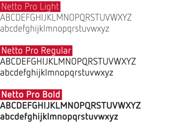
The display font primarily serves to display larger font sizes of 14 pt and up. »FF Netto« lends the company a modern and friendly look and feel with its reduced and soft, but still geometrical typeface. Renfert stands for these characteristics with its customers.
»FF Netto« is available in different styles. The three styles light, regular and bold are the ones that are most commonly used.
Applications
Media titles, headlines, slogans, product names, price labels, etc.
Font license
FF Netto can be ordered and licensed here: https://www.typemates.com/fonts/netto-and-icons
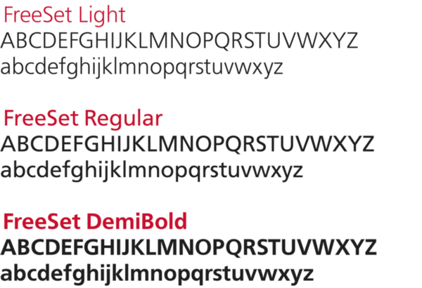
Reading texts in a small font size (< 14 pt) are typeset in the clearly legible sans serif font FreeSet. The FreeSet font family originates from Frutiger and is nearly identical to it. Due to their clear shapes and the open typeface, they are very suitable for all media channels and for small font sizes below 10 pt.
FreeSet is available in various styles. The styles light, regular and demibold are used.
Applications
FreeSet Light for continuous texts, subheadings and image captions
FreeSet Regular for excerpts within continuous texts
FreeSet Demibold for section headings
The FreeSet family is also used as a substitute font for the display font when it does not include the required glyphs for a foreign language, such as Russian.
Font license
FreeSet can be ordered and licensed here:
https://www.fontshop.com/families/freeset-multilingual
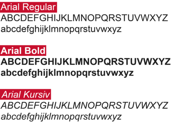
Correspondence by means of printed letters or email is carried out with the standard font Arial, which is included with Microsoft operating systems. Because it is available on almost all computer systems, the typeface is also retained on computers outside of the company.
Arial is characterized by large x-heights and simple shapes, which make it clearly legible both in print and on screen.
Arial is available in the styles regular, bold and italic.
Applications
Letters, faxes, emails and similar forms of correspondence.
Renfert imagery
The imagery makes an essential contribution to the visual appearance of the Renfert brand. Images awaken emotions and create the necessary identification with the brand. Different purposes require different image criteria. The criteria described here serve as an aid when planning and carrying out photo shoots.

Task
The key visuals make the Renfert brand experience palpable and illustrate that working with Renfert products is easy, uncomplicated and carefree.
Description
These images include the portrait of a man in a fresh and bright environment, the brand aura. His facial expression radiates the “Renfert feeling”, is positive and is selected to fit the topic (example from SILENT Extractions: inner calm, relaxed, breathing deeply). The portrait part of his head is cross-faded in a kind of double exposure; here the person is to be seen as in harmony with his work. The image is calm and eye-catching, not too detailed, and shows someone concentrating on his work. Alternatively, it can be seen as a detail from the work. Hands that create; perfection and a good working atmosphere are visible and palpable.
Use of these motifs
Key visuals are used in harmony with the brand logo and slogan. As an eye-catcher they are an element of advertisements, the website (homepage), on covers (catalogues) and in large format at trade fairs.
Additional information
We are happy to provide photographers with a comprehensive description for contracted photo shoots on request.


Image motifs
Task and description
The image motifs are a continuation of what catches the “head feeling” in the key visuals. They show scenes of people and their work. Work they identify with and an environment where they feel good. The brand promise and user experience should be palpable. The images stand out because of their emotionality and show what working with Renfert products feels like.
Use of these motifs
All these motifs are an element of advertisements (content level), of product-image and making-work-easy pages in catalogues and brochures, colored red in digital advertisements (web banners) and as a background in print advertisements and product-image pages in catalogues and brochures.
Additional information
We are happy to provide photographers with a comprehensive description for contracted photo shoots on request

A person at work, focus on the people in the work environment.
The image is calm and eye-catching, not too detailed, and shows someone concentrating on his work. The person should not look into the camera, but should be turned toward it. If they are turned away, this should only be to the extent that their facial expression is still recognizable. The person and their work are closely connected. The room/environment can be detected in the background, but it is blurred. The selection of perspective and sharpness/blurring is chosen so that observers feel like they have been transported to the scene.


Person at work, focus on what is being done
In these images the focus is on the action itself, filling the image. The motifs are calm and show details of the work. If the person’s body can be seen at all, it is only in outlines. The focus range is on the center of the action. The images are bright, have soft contrasts, interesting perspectives and a harmonious distribution due to sharpness/blurring.


In this motif the product is illuminated on all sides, with beautiful light angles and soft shadows. Devices are shown in a work environment that fits the brand aura. Small materials and instruments are placed in front of a soft and out-of-focus background.
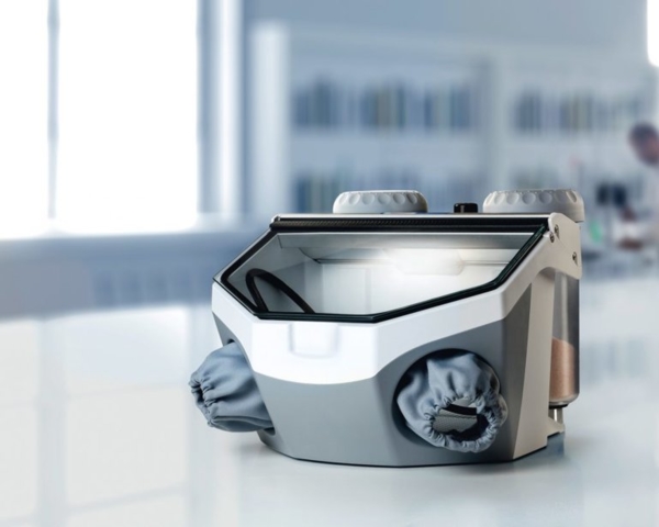
These motifs show only a part of the product. The focus is on a “making work easy” feature.

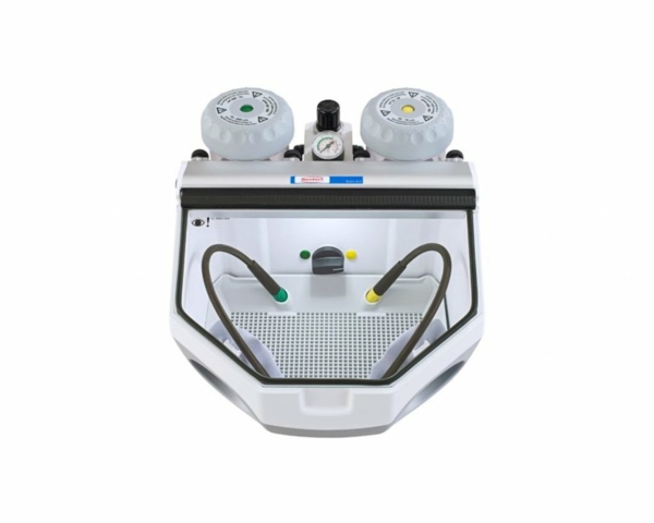
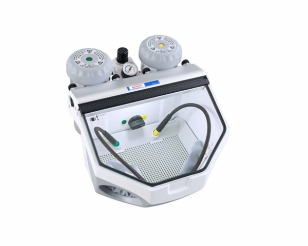
Standard motifs
Task and description
The standard product motifs are arranged to give optimal visibility to product details. The images are neutral in color and show the product as three-dimensionally as possible.
Use of these motifs
The motifs are an element of product descriptions in the web, in catalogues, brochures, instructions and guidelines.
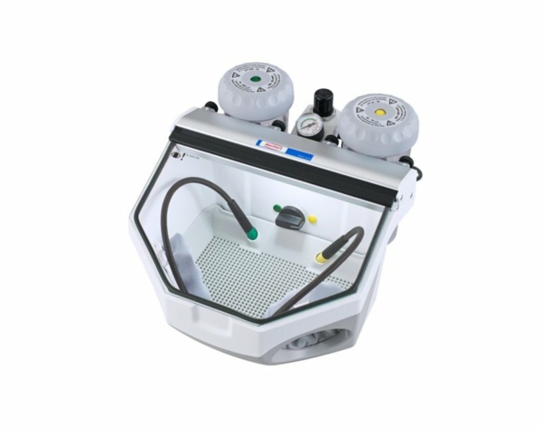
These images are available in three perspectives: Frontal and rotated +/- 45° left and right so that the dimension of the product is visible. The motifs have a continuous focus and are made available.
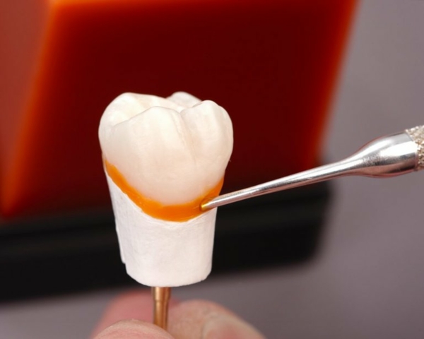
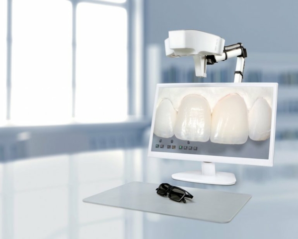
These motifs show certain details and actions in a documentary way. The scene is optimally illuminated, and the action or the product benefit is clearly visible. Images of this kind are also used for teaching materials and are therefore used in instructions and guidelines. Value is placed on the clear visibility of the work step or the result. The emotion of the image is the brilliance of the work shown. To make the natural aesthetic of small nuances such as transparency or opacity visible, there must be optimal contrast. Teeth are therefore often photographed in front of monochromatic, dark to black backgrounds.